Magical Ice Cream
As part of the DM122 Principles of Graphic Design coursework, Dara created a brand identity and packaging system for Magical Ice Cream, a fictional company. The project included competitor research, logo development, and refinement in Adobe Illustrator using a pastel palette and Loretta Display typeface. The identity was applied to ice cream pint packaging and presented through a polished 3D mock-up in Photoshop.
The completed project highlights Dara’s ability to merge research, creativity, and technical skills into a playful yet professional brand identity with strong market appeal.
Software Used: Adobe Illustrator, Adobe Photoshop
Color Pallete
#E0B23E
#DDF2FD
#FFFFFF
#F4C6DC
#C1AFD5
Research & Logo Design
The project began with market and competitor research, analyzing brands such as Ben & Jerry’s, Van Leeuwen, and Coolhaus. This exploration highlighted how established ice cream companies communicate identity through color palettes, typography, and packaging styles, which informed how Magical Ice Cream could stand out with its whimsical, hand-crafted, and nostalgic feel.
Based on the brand values - fun, magical, and artisanal - Dara sketched three distinct logo concepts:
Vintage Magic Jar – a nostalgic mason jar filled with cloud-like scoops.
Playful Rainbow Scoop – a colorful pastel scoop symbolizing inclusivity and joy.
Minimalist Script with Sparkle – elegant type with a whimsical accent
Peer feedback guided the refinement process, leading to a finalized logo created in Adobe Illustrator. The design featured Loretta Display VF Regular paired with a pastel-based color palette

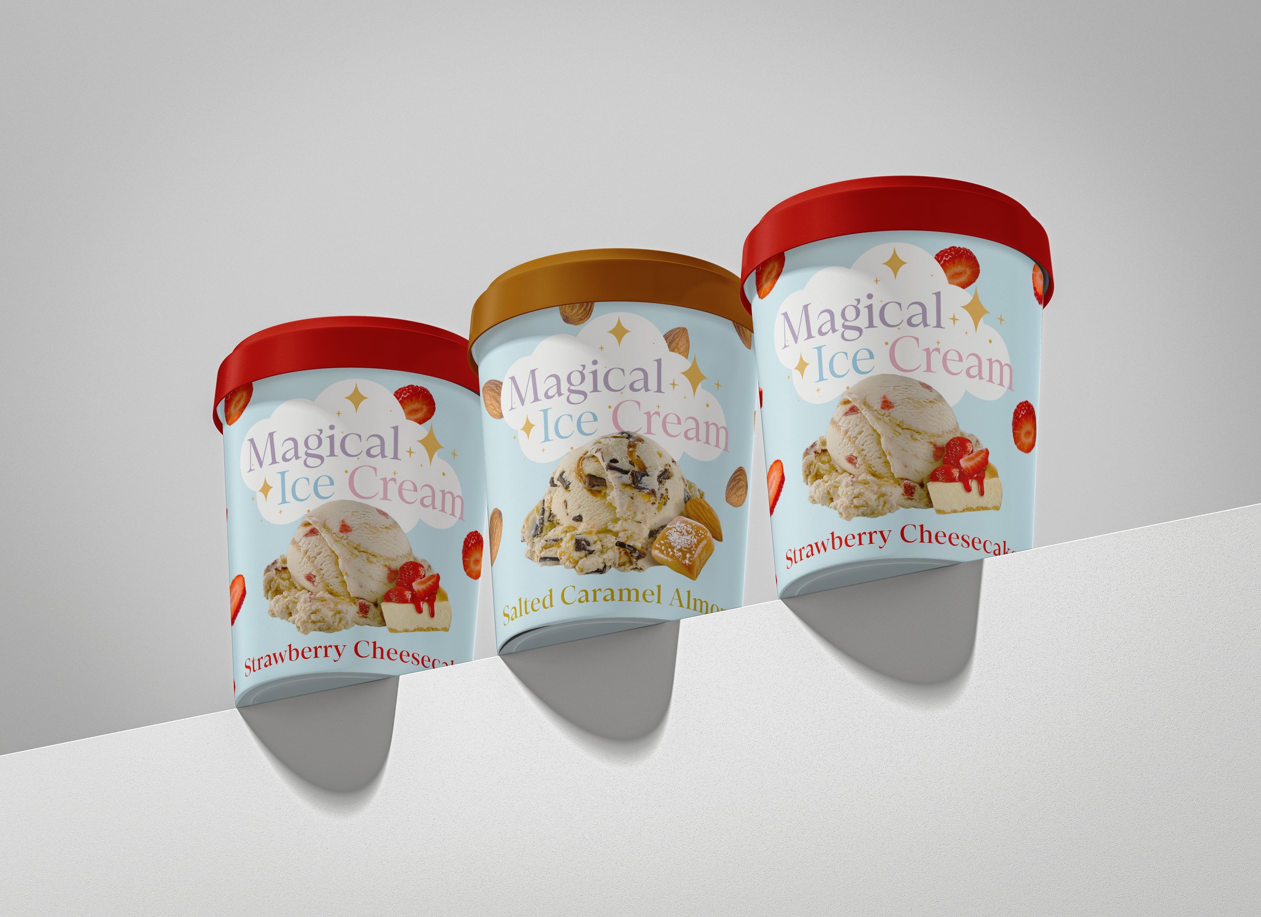
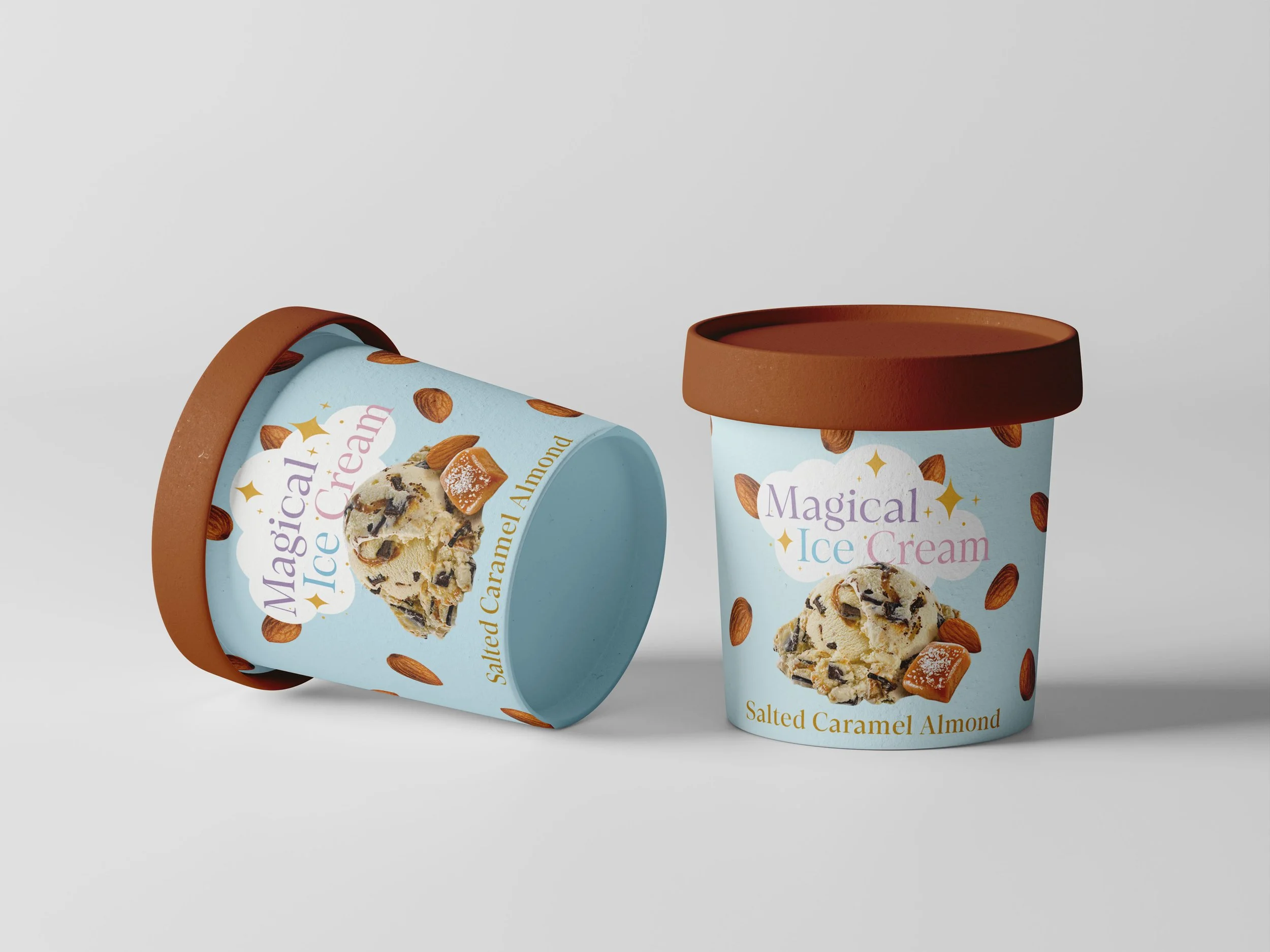
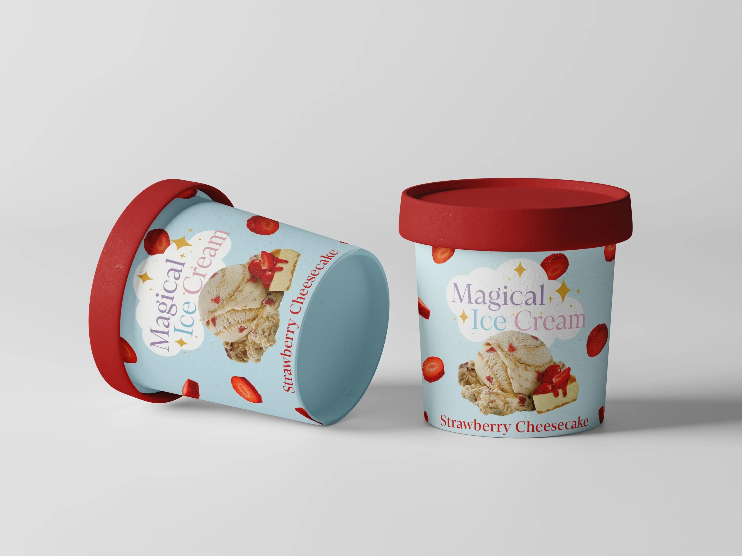
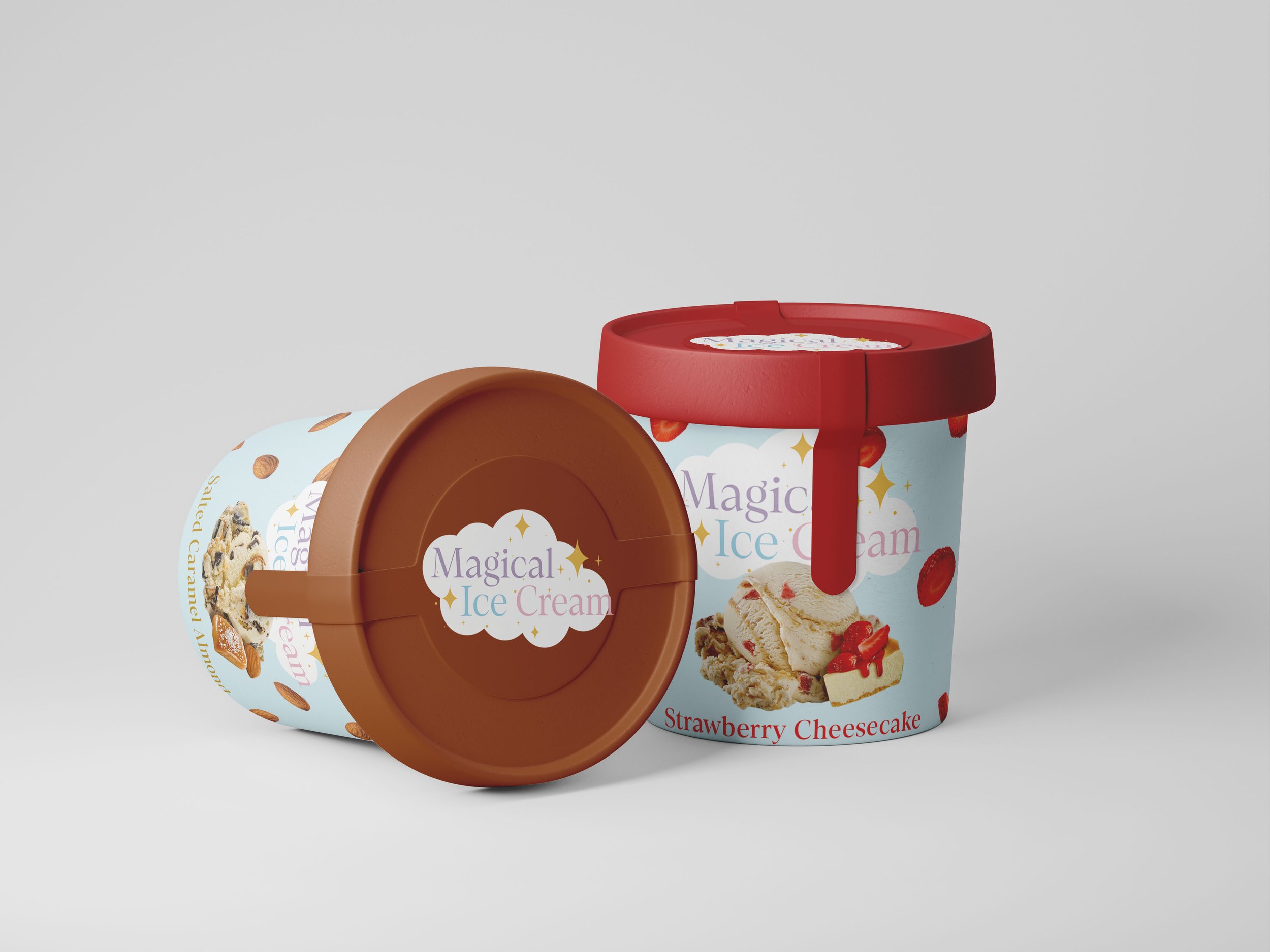
Packaging Design
The branding was then extended into ice cream pint packaging. Dara began with hand-drawn sketches, experimenting with layout and composition, before producing a digital design in Illustrator. The packaging incorporated the logo, fonts, and brand colors, and was finalized with a professional 3D mock-up created in Adobe Photoshop
The completed design delivers a cohesive brand identity system that communicates magic, nostalgia, and artisanal quality. The final pint packaging mock-up demonstrates how the brand could stand out on store shelves while appealing to a youthful, fun-loving audience.